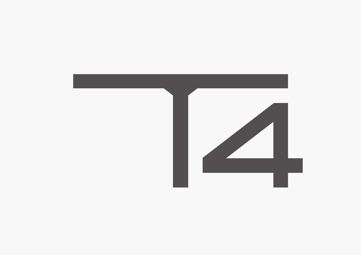
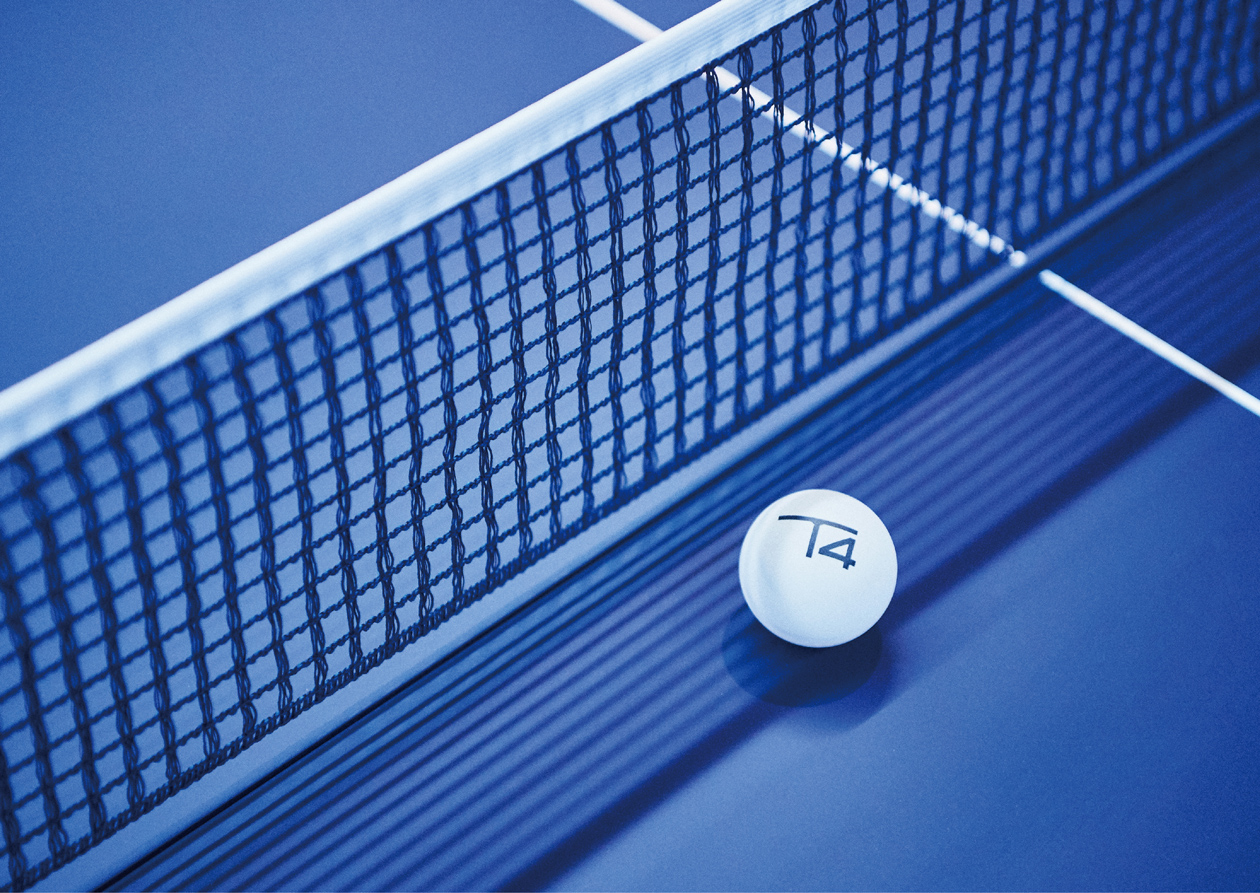
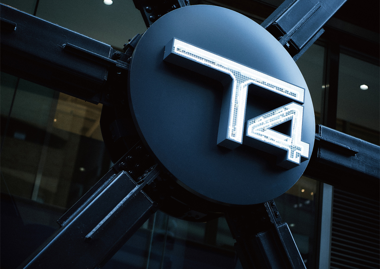
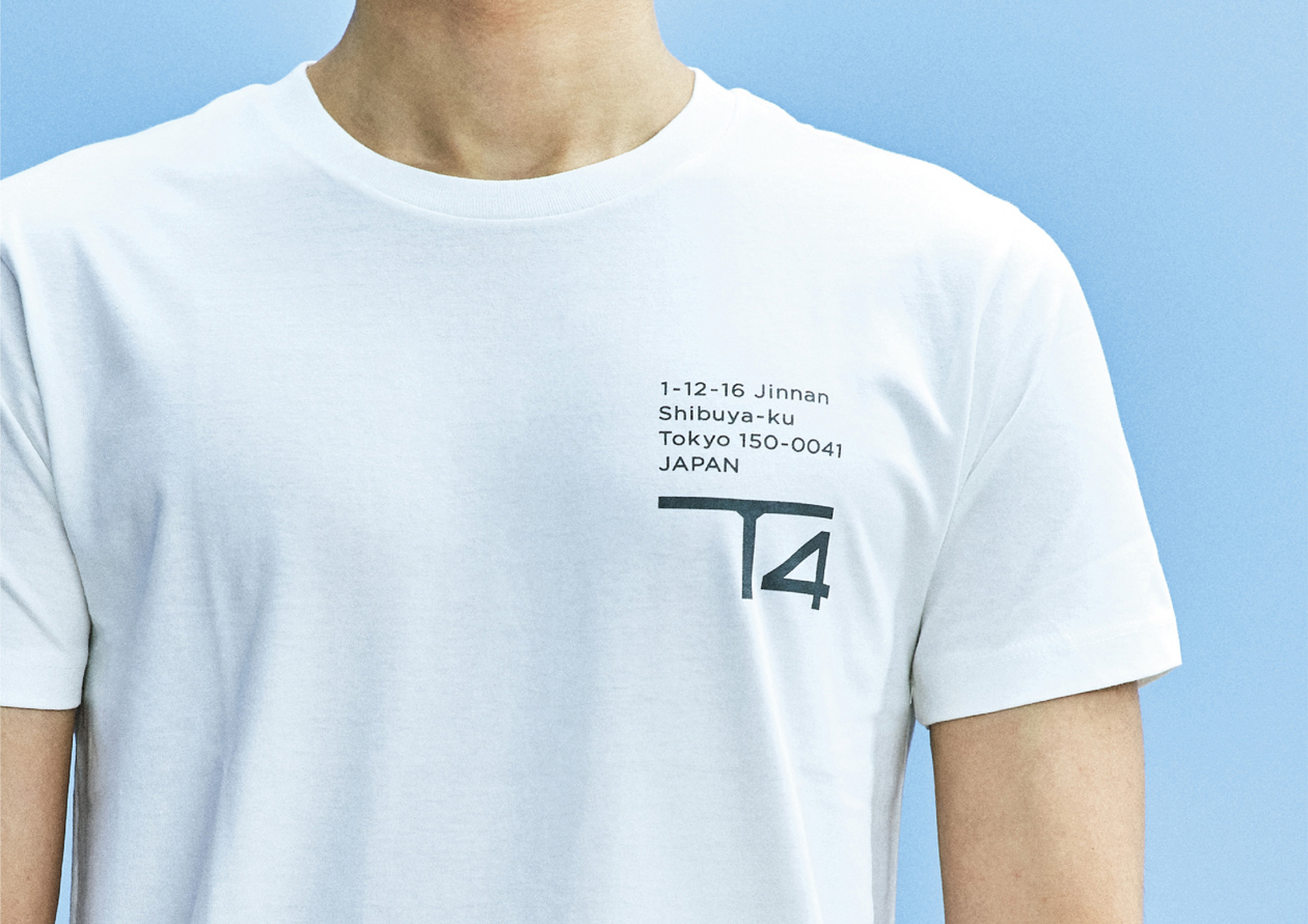
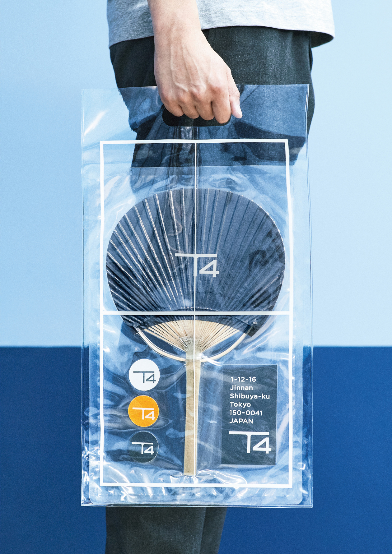
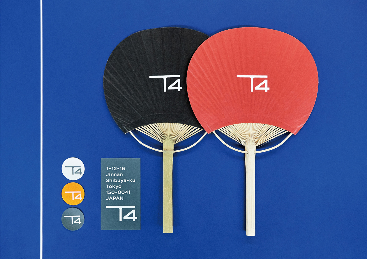
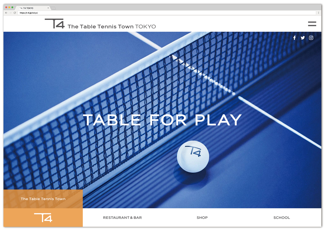
渋谷にある卓球施設「T4」のブランディングプロジェクト。ロゴやサイン、ユニフォーム、ノベルティグッズ、Webサイトなど幅広くディレクション・デザインを担当しています。卓球台や、ダイニングテーブルをモチーフにした「T」を特徴とするロゴや、卓球台の線的な要素を活かしたデザインを通して、卓球のイメージを上げるべくスマートで洗練された世界観を作っています。
Branding project for "T4", a table tennis facility in Shibuya. We were responsible for the direction and design of a wide range of items, including the logo, signage, uniforms, novelty goods, and website. We are creating a smart and sophisticated worldview to elevate the image of table tennis through a logo featuring a "T" in the form of a ping-pong table and a dining table, as well as a design that utilizes the linear elements of a ping-pong table.