

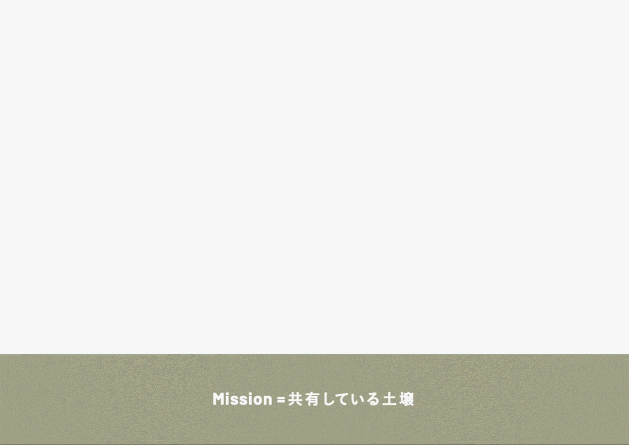

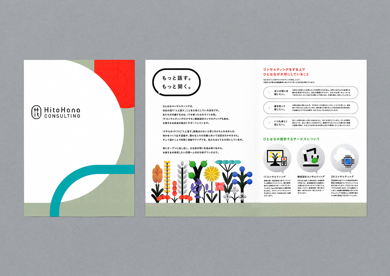
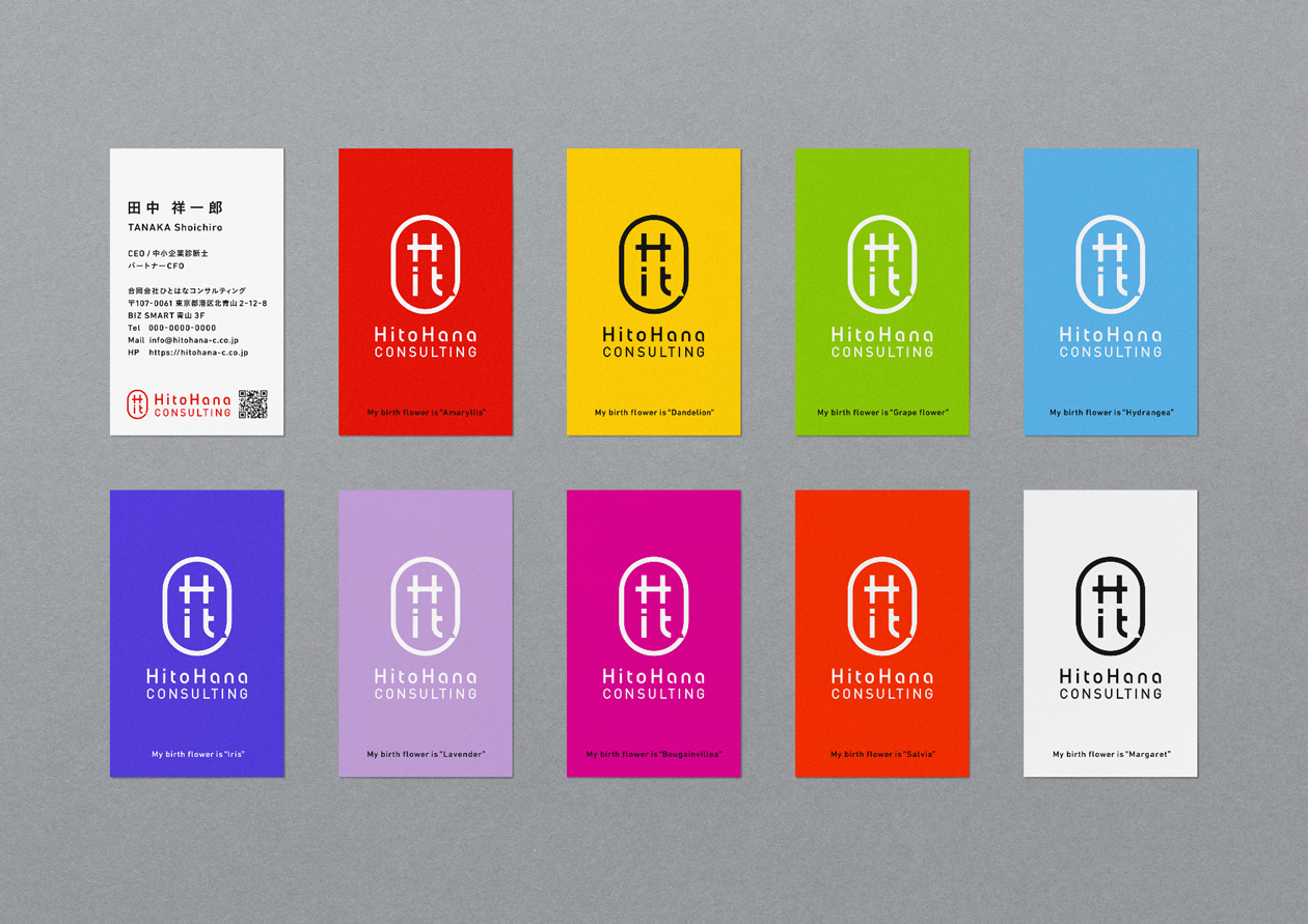


「人と話す」をコンセプトとするITコンサルティング会社「ひとはなコンサルティング」のリブランディングプロジェクト。企業の核となるミッションやビジョンなどの言葉の開発や、ロゴ、モーションロゴ、Web、キービジュアル、リーフレット、名刺、社内ツール、SNS監修など幅広くディレクション・デザインしています。ロゴマークはHitoの文字を内包した“花”と吹き出しで表現。このデザインを元に、吹き出しと花をモチーフとしてコミュニケーションツールへと展開。親しみを感じる唯一無二な世界観を作り、コンサルティングという仕事自体がもっと開かれた存在になっていくことを目指しています。
Rebranding project for “HitoHana CONSULTING,” the IT consulting firm based on the concept of talking to people. We directed and designed a wide range of elements, including the development of words for the company's core mission and vision, logo, motion logo, web, key visuals, leaflets, business cards, internal tools, and SNS supervision. The logo mark consists the flower and a speech bubble containing the word "Hito". Based on this design, the balloon and flower motif was developed into a communication tool. Our goal is to create a one-of-a-kind worldview that feels familiar, and to make the consulting business itself more open.