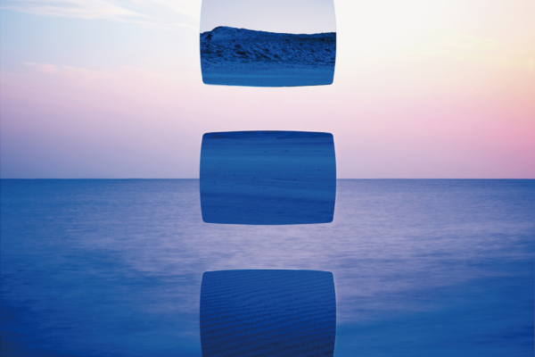
銀座にある美容室「fossette」のブランディングプロジェクト。ロゴやサイン、名刺やリーフレット、コンセプトブック、キービジュアルなどを担当しています。フランス語でえくぼという意味の「fossette」は、髪を切るだけでなく、お客さんがリラックスできて、思わず微笑んでしまうような空間づくりをしています。キービジュアルはその空間自体をテーマにし「鏡に映ったリラックス空間」を優しいイラストで表現。美容室ならではの鏡をモチーフに、まるで鏡のようなシルバーの紙に印刷を施しています。
Branding project for a beauty salon "fossette" in Ginza. We were in charge of the logo, signage, business cards, leaflets, concept book, and key visuals. The name "fossette," which means dimple in French, is not only about getting a haircut, it is about creating a space where customers can relax and smile unintentionally. The key visual is based on the theme of the space itself, depicting a relaxing space reflected in a mirror in a gentle illustration. The motif is a mirror, which is unique to beauty salons, and is printed on silver paper that looks like a mirror.