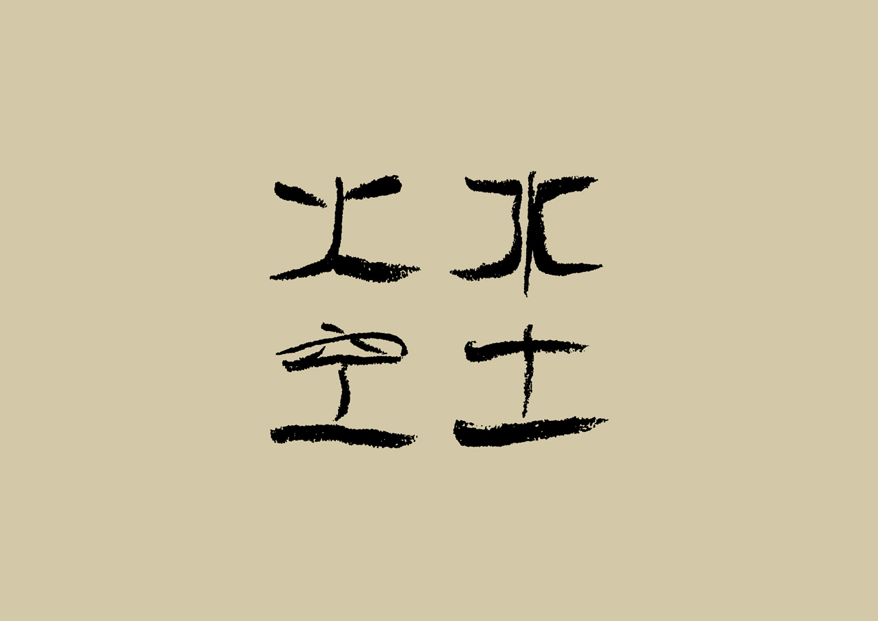


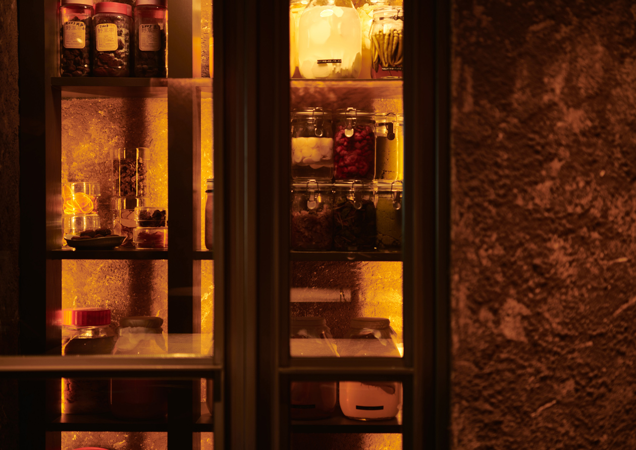
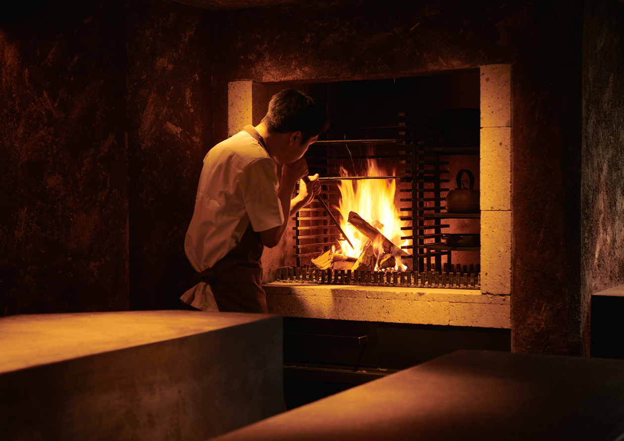
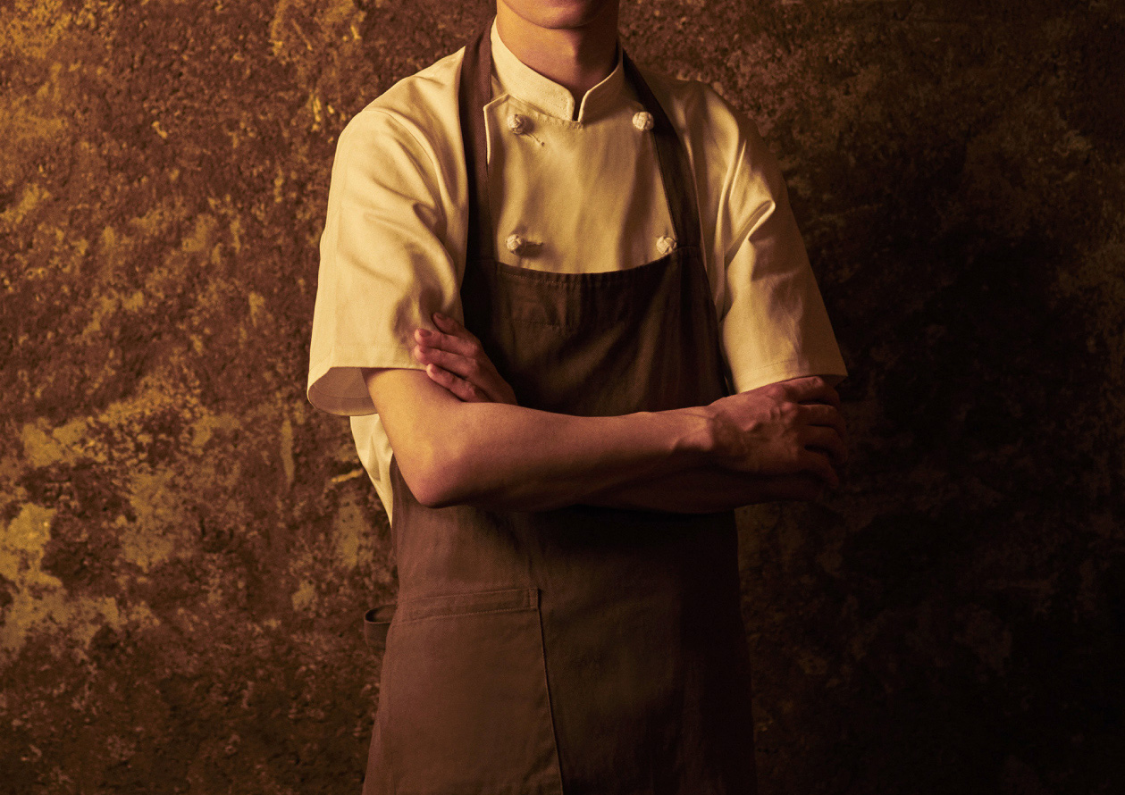

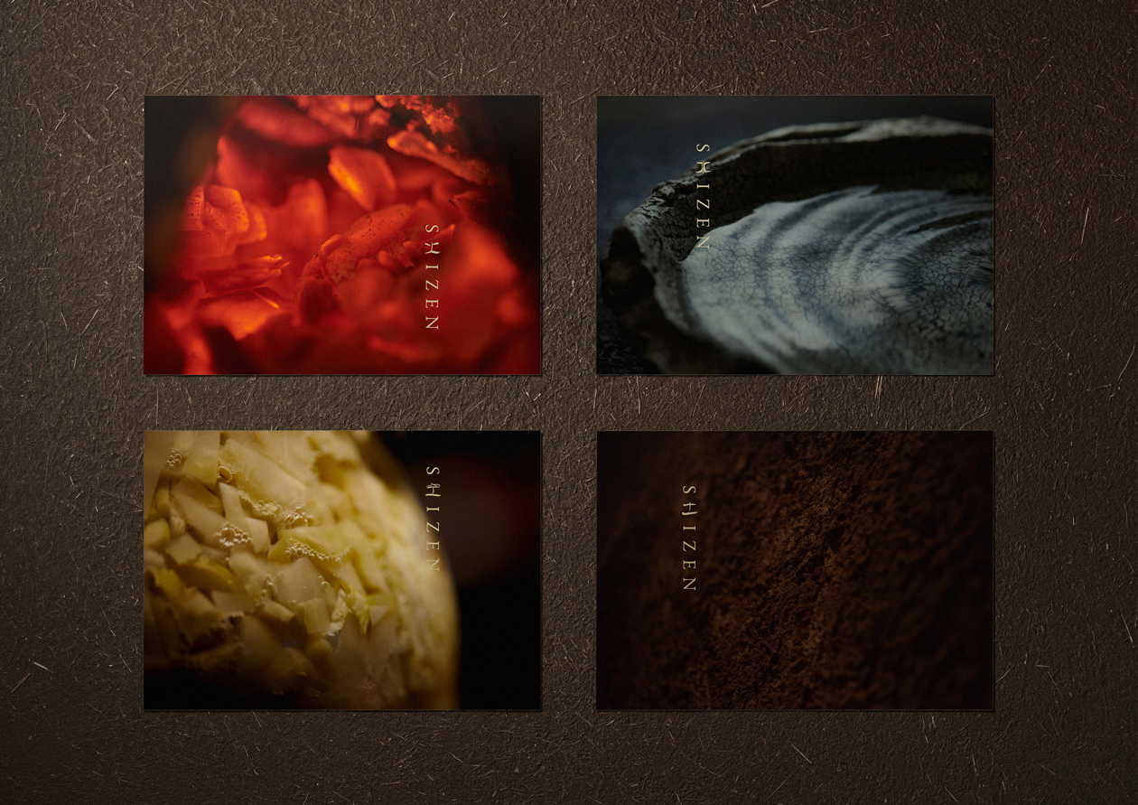


薪火と発酵を取り入れた日本料理のコース・ペアリングが味わえる店「SHIZEN」のブランディングプロジェクト。コンセプトメイキングや空間デザインなどから携わり、「火を起こす、水を汲む、空気に触れる、土と結ぶ。」というコンセプトのもと「火 / 水 / 空 / 土」の字を含んだロゴや、サイン、さまざまなツールのデザインや、SNSにおける写真のトーン開発などを通して、統一した世界観を作っています。
Branding project for "SHIZEN", a restaurant that offers Japanese cuisine courses and pairings that incorporate wood-fired fire and fermentation. We were involved in the concept making and spatial design of the restaurant, and created a logo that includes the characters for "fire," "water," "air," and "earth," as well as a sign and a variety of other items. We created a unified worldview through the design of the logo, signage, and various tools, as well as the development of the tone of the photos used on SNS.